
Packaging design & brand systems
Make the package
part of the story.
Distinctive packaging starts with a distinctive brand. We connect strategy, identity and product information across bottles, bags and the wider product family.
01 / Spirits packaging
Rodeo de
las Aguas
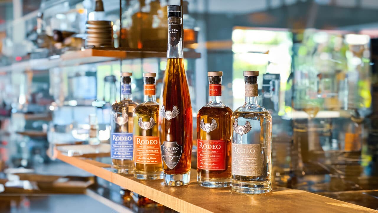
A heritage-led identity, made tangible.
Historical research and naming set the foundation for Rodeo de las Aguas. ElephantMark carried that story into the identity, packaging architecture and custom packaging solutions.
The bottle became a central brand experience, with form, label hierarchy, materials and finishing considered together. A consistent visual language connects the expressions while giving each its own place in the family.
Explore the Rodeo case study →
Brand strategy & naming · Identity design · Packaging architecture · Custom packaging
Specialty packaging / Collector edition
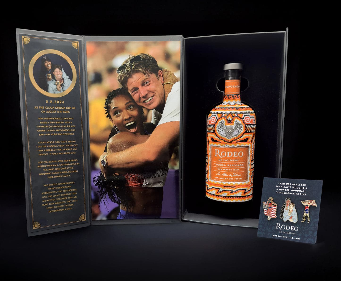
8:8 Reposado.
A collector’s presentation.
Custom specialty packaging for Rodeo de las Aguas’ 8:8 Reposado collector release. The presentation box brings commemorative storytelling together with a fitted bottle display and supporting collector materials.
Packaging design: Joseph Maguire / ElephantMark.
Bottle hand-beading: Wixárika artisans in Jalisco, Mexico.
02 / Coffee branding & packaging
Full Armor
Coffee
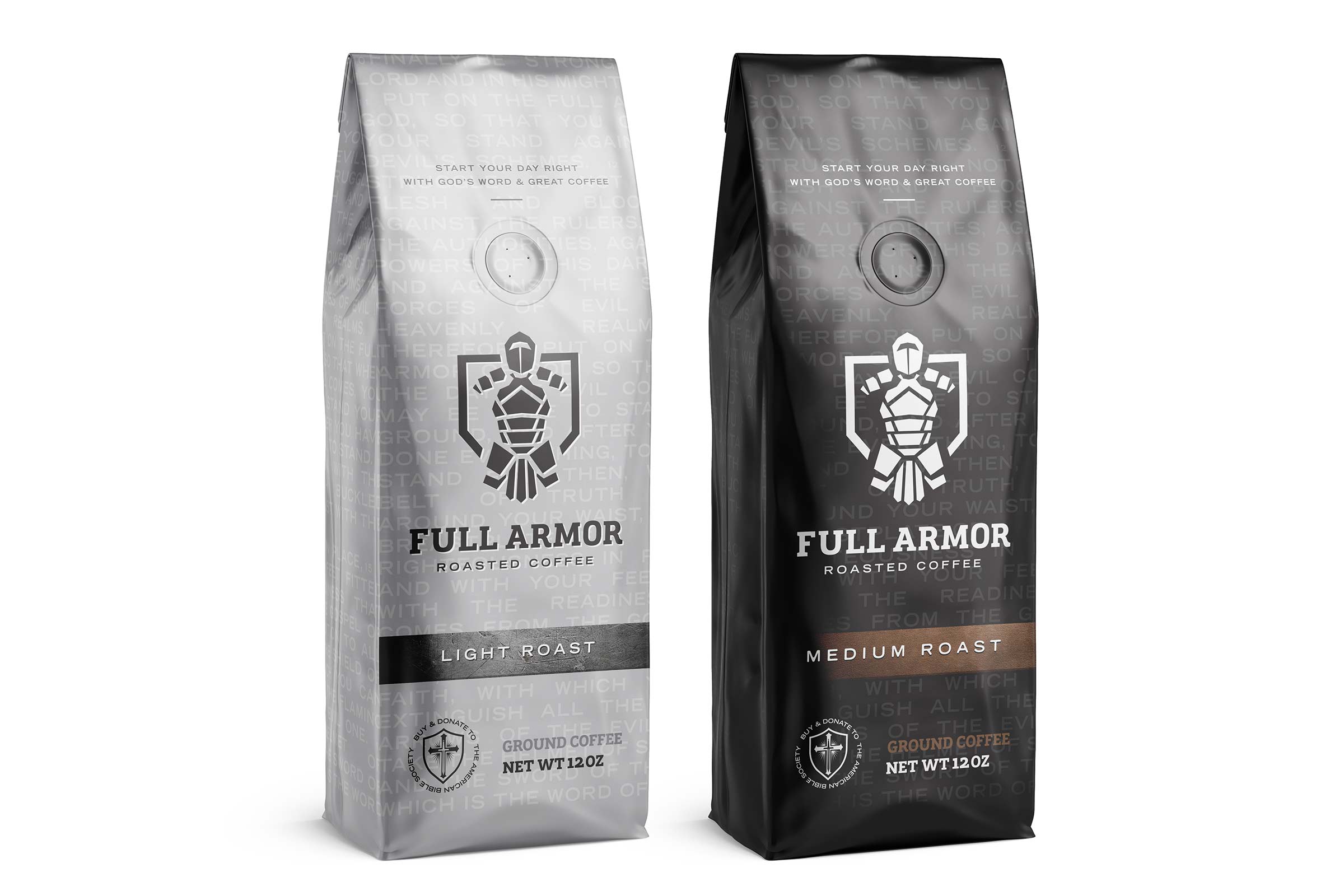
One identity. Two distinct roasts.
The Full Armor Roasted Coffee identity centers on an armored figure and a bold wordmark. The packaging applies that system to contrasting light-roast and medium-roast bags, with clear roast labels and a consistent front-of-pack structure.
A restrained palette lets the identity do the work while the package treatments distinguish the two products.
See the archived design project →
Brand identity · Coffee packaging design
Design: Joseph Maguire / ElephantMark. Archived branding and packaging work; product imagery is presented as a design example.
03 / Snack branding & packaging
Yuca Balls
A colorful family.
A clear point of view.
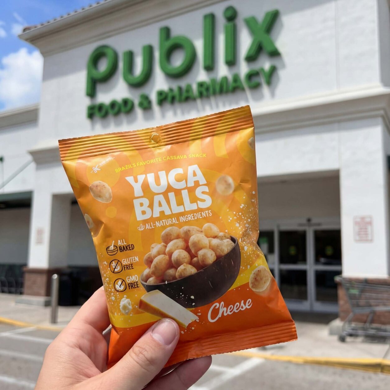
ElephantMark developed the Yuca Balls name, identity and packaging for the complete product line. Expressive color, consistent typography and product photography bring the flavors together without making them all look the same.
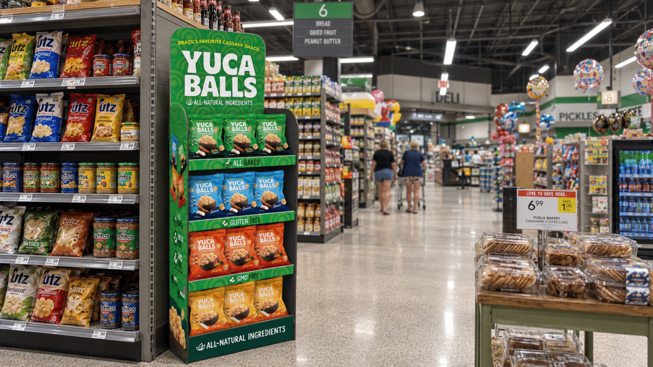
The brand extends beyond the bag into custom point-of-purchase displays, marketing materials and a website with a store locator—connecting the package to the wider retail experience.
Explore the Yuca Balls case study →
Naming & identity · Full-line packaging · Product photography · Point-of-purchase displays
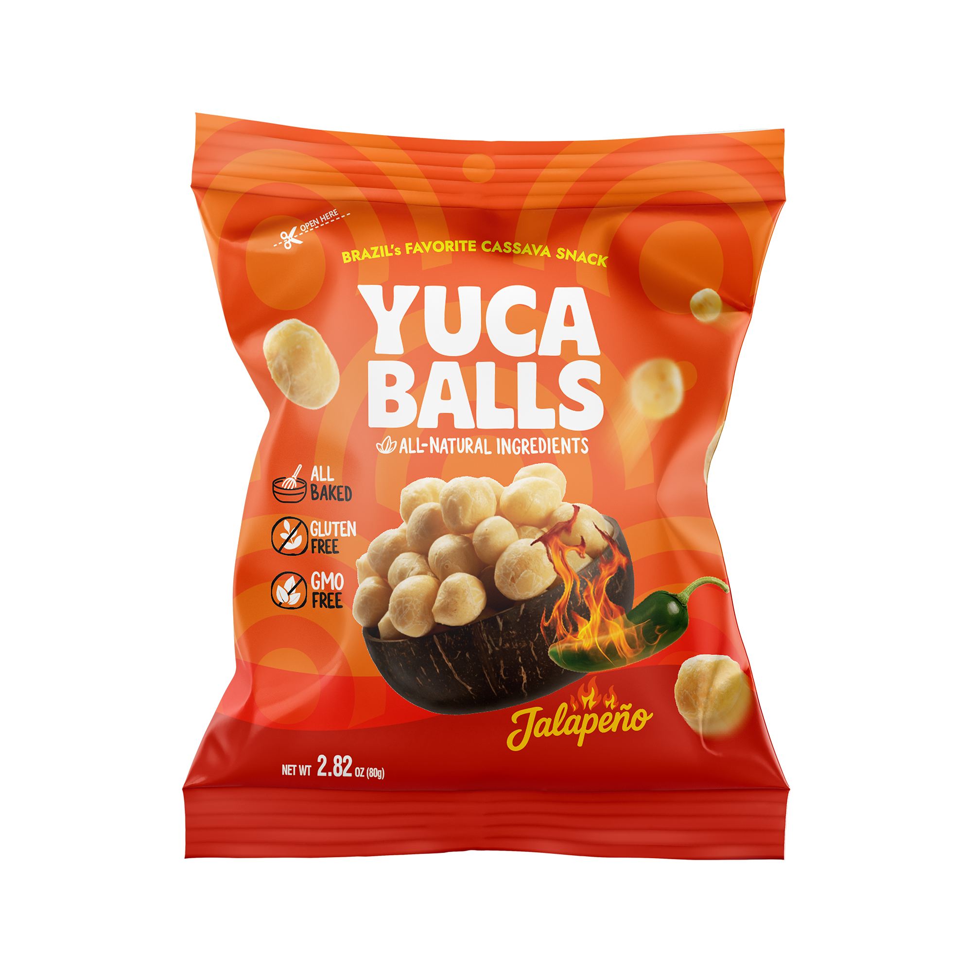
Food photoshoot direction & product photography
Start with the food.
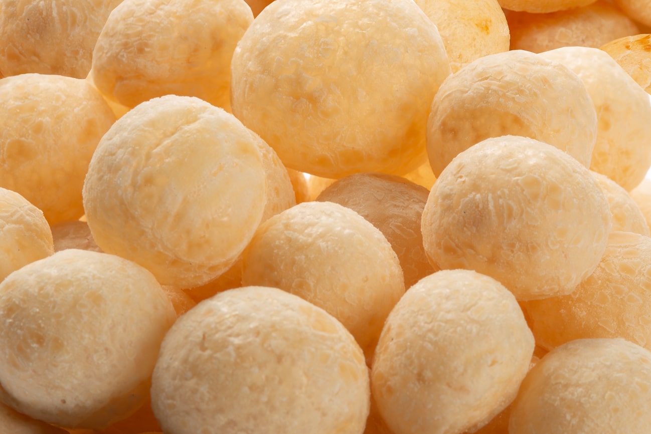
ElephantMark oversaw the Yuca Balls photoshoot and developed product photography alongside the packaging system. The food’s texture and character became part of the brand’s visual story—not an afterthought.
04 / Beverage can design
Tropic Shark
Bold color.
A recognizable can family.
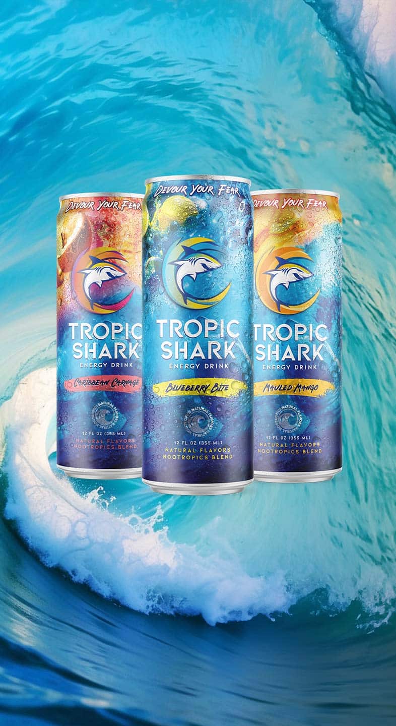
The Tropic Shark can presentation brings the shark identity, ocean-inspired graphics and flavor-specific colors into one recognizable product family.
The shared layout keeps the brand consistent while distinct color treatments give each can its own personality.
Brand naming · Can graphics · Product-family presentation
Selected can-design artwork from the ElephantMark project archive.
From brand idea to product family
Designed as a system.
Not just a single surface.
We shape the creative scope around your product, audience, formats and production requirements.
01 / Strategy & identity
Know what the brand stands for.
Clarify the audience, positioning and visual direction before developing the package. Connect naming, messaging and identity where the project calls for them.
02 / Packaging design
Give every detail a role.
Build a clear hierarchy for brand, product and variant information. Develop the visual system across the formats and product range in scope.
03 / Applications
Carry the identity further.
Connect packaging with retail displays, photography, campaign creative and digital touchpoints. Review artwork against the specifications supplied by the project’s production partners.
Let’s talk about your product
What should your
packaging say?
Tell us about your product range, formats, audience and launch plans. We’ll define the creative scope around the brand you want to build.